
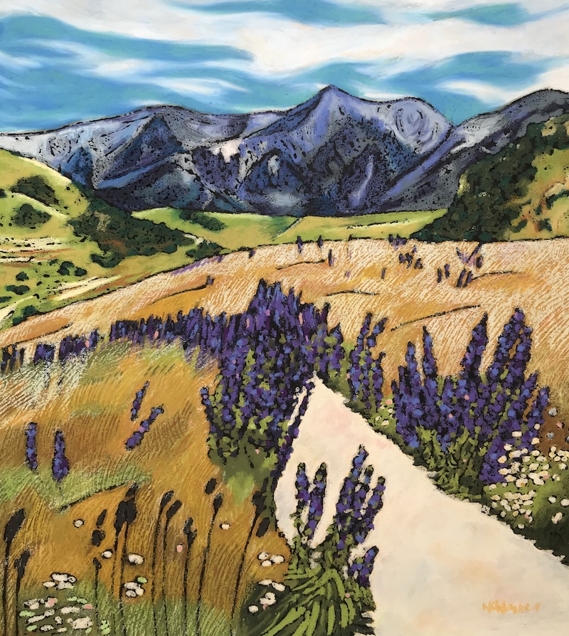
Before I became an interior designer I was an artist. You would think that knowing about the colour theory of art would make choosing paint colours for homes a piece of cake, but when it came to neutrals I didn’t find it that easy. What made a difference to me was learning how to think about paint colours in a different way.
Forget the traditional colour wheel for the moment. For practical purposes, the paint colours you use in home interiors fall into five main groups.
- Whites
- Barely there neutrals
- Neutrals
- Colours
- Darks
Once you know which group of paint colour you’re after, you’ve instantly ruled out 80% of the fan deck.
Whites
People use the the term ‘white’ very loosely. I mean THE lightest paint colours – true white, off-white and cream. Just because a paint colour has the word ‘white’ in it, doesn’t necessarily mean it’s white. Chances are it’s a pale neutral and if you treat it like a white it’s going to boss your colour scheme around.
Likewise, there are plenty of lovely whites with exotic names that don’t hint at the fact that they’re actually white.
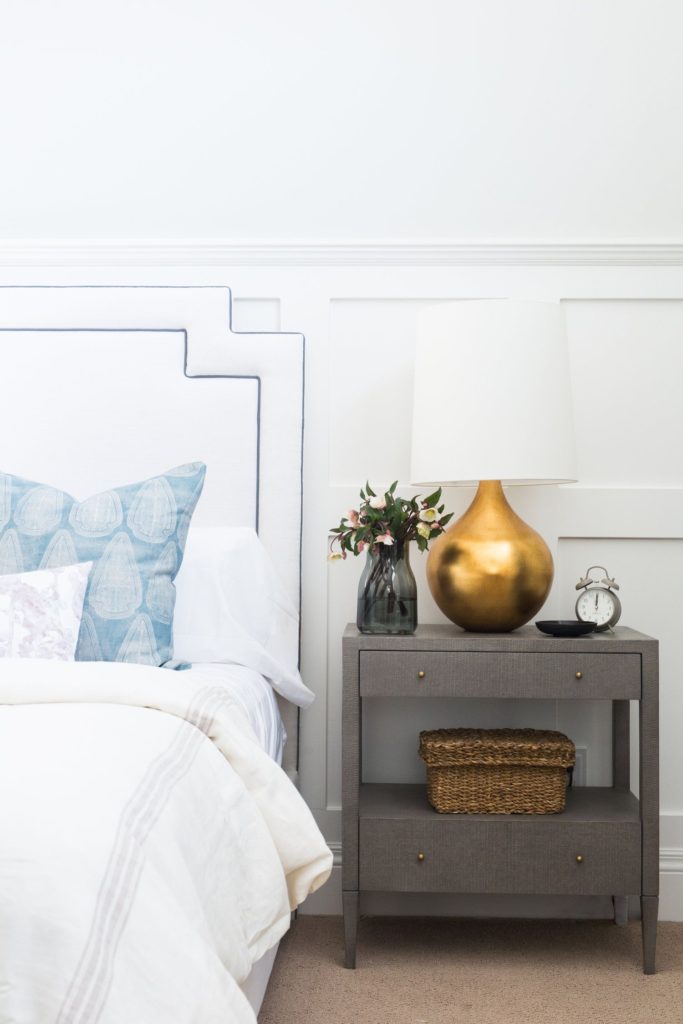
True white, off-white and cream will usually be what you’ll be looking for when you’re deciding on an interior trim colour or want white walls.


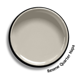
Barely there neutrals
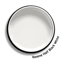
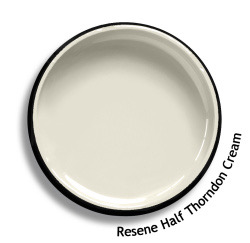
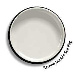
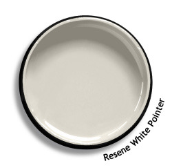
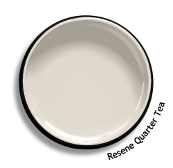
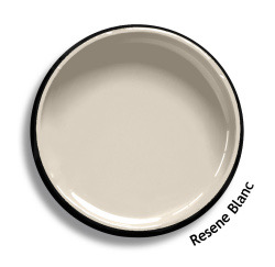
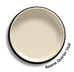
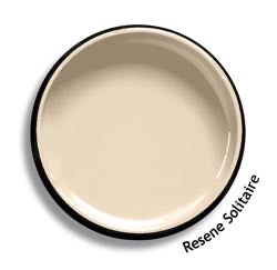
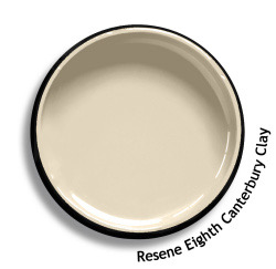
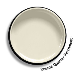
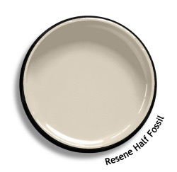
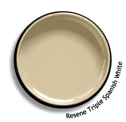
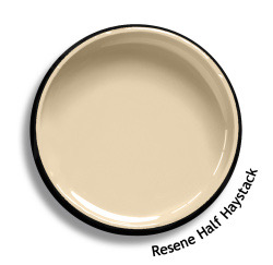
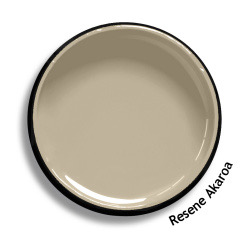
Who’s heard of Resene Quarter Tea? It’s been one of Resene’s most popular neutrals and rightly so. It’s that barely there, pale colour that can look gray or green or beige depending on the light and what it’s next to.
Barely there neutrals are like Quarter Tea. They have an LRV around 74 and they can be chameleons once they’re on the walls. They’re fantastic if you want pale walls that aren’t as stark as white. You can use them as your main neutral throughout the whole house and they’ll bring a room with little natural light to life in a way that white never will. In magazine articles you’ll sometimes find them called ‘whites’ even if they’re not, but I find it more helpful to think of them as ‘barely there neutrals’. Here’s why:
Barely there neutrals have undertones. Too many undertones (or ones that clash) can make or break a colour scheme but get them right and your home will look effortlessly harmonious. Undertones are a topic for other posts, but for now you’ll see the subtle differences below. You can see why Quarter Tea has been so versatile – it’s actually a pale taupe so it sits right in the sweet spot between the cooler very pale greys (grieges) and warmer pale beiges (aka complex creams).
Neutrals
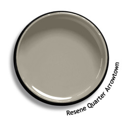
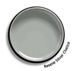
Whites and barely there neutrals are definitely more popular than mid-range neutrals at the moment. However, if you painted in the early 2000s or completely embraced the grey trend you’ve probably had more to do with these mid-toned neutrals.
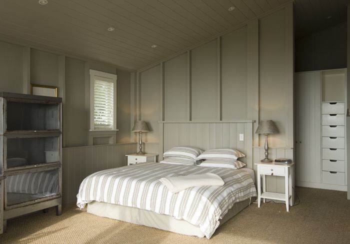
Like their very pale versions, neutrals have undertones but because they’re darker the undertones are much more noticeable and you really can’t ignore them. It’s a myth that neutrals go with anything. They don’t and some are a lot bossier than others. Don’t let that put you off though. Train your eyes to see the different neutrals and then repeat them purposefully and you’ll create some stunning spaces.
See how much more obvious the undertones are:


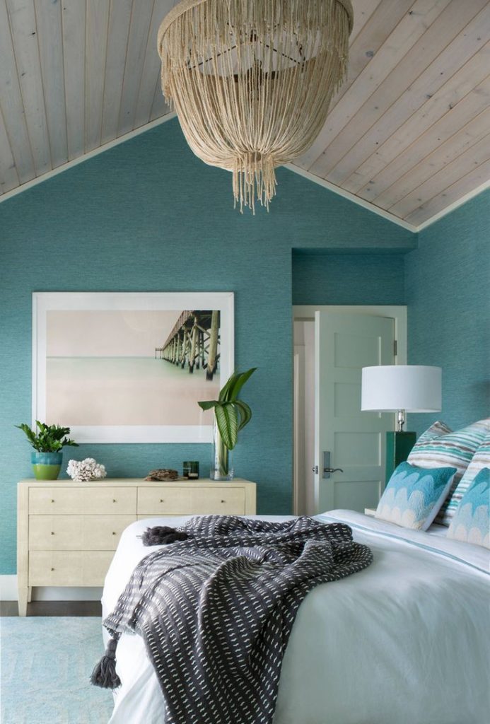
Colour
Hooray for colour! It can be completely timeless and totally personal. I sometimes feel like I need multiple houses so I can have one in calming neutrals and other ones in all sorts of colour combos. I think there’s a reason why children choose to have coloured bedroom walls if they’re allowed – they’re joyful, individual and uninhibited. (Confession – I didn’t let my young son paint his walls red. It would’ve clashed with his duvet so we did a gorgeous blue and yellow. I think he’s forgiven me now. Just. He’s 25, so that helps. But I digress…)
When we talk about neutrals, figuring out the undertone is the key to choosing the right one. Colour is different. With colour it’s more useful to describe it like this:
Lighter or darker
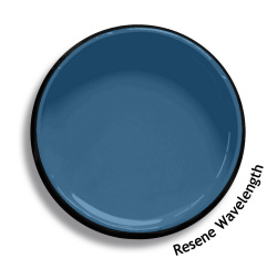

Warmer or cooler
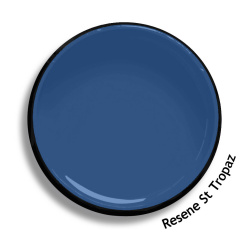
Cleaner or dirtier
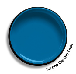
Also be aware that colours that look pretty on the paint chip can be too candy coloured on the wall. Choosing something that looks greyer or dirtier on the paint chip will often give you a much better result.
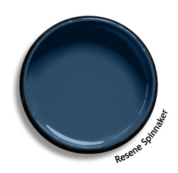
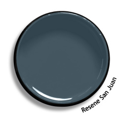
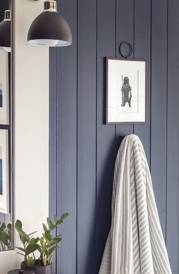
Darks
These are, obviously, all your really dark colours. Blacks, browns, darkest neutrals and colours so dark they’re almost not colours anymore. Like mid-range neutrals, look for the undertones so that you don’t get any surprises when you see them en masse.
Thinking of paint colour in these five categories is going to make your life a whole lot easier.
So…
Step one: What are you looking for – a white, barely there neutral, mid-neutral, colour or dark?
In the next posts I’ll be sharing more about how to choose whites, neutrals and colours, and the enormously helpful system for understanding undertones that I learned from Maria Killam. All with NZ paint colours!
Thankyou Thankyou Thankyou – this is brilliant xx
You’re welcome welcome welcome! Working on the whites post now…
I’m loving these blog posts using Maria’s ideas with Resene colours. I only wish you’d continued on with them! I’ve got a lot to learn.
Thank you! I must write more. I WILL! Covid (and an art project) have put blogging about paint colours on the back burner but I’m planning to get back into it again soon. If you’ve signed up for the newsletter I’ll let you know when new posts are up. x Nicola