For most people, choosing a neutral paint colour means looking for that one non-colour which goes with everything. The truth is, there are no non-colours, not even neutrals, but you can learn to pick the best neutral for your space quickly and easily. The secret to choosing the best neutral paint colour is learning to recognise the nine neutral undertones, then picking the right one!
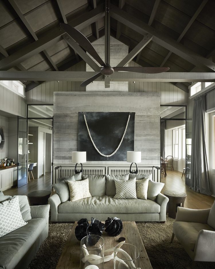
I’m torn between loving colour and adoring neutrals. Colours are life, personality and excitement, whether they’re pale and soft or bright and saturated. Neutrals are different. They’re easy to live with. They make other things look good.
Neutrals don’t go with everything
Unfortunately neutrals don’t go with everything. Life would be a easier if they did, but in spite of their close resemblance to pretty mud, neutrals are colours too. Some of them go well together. Some really don’t. If you put too many together you get the mud version of too many clashing colours. Some will look great with clean fresh colours. Others will look better with earthier colours. So how on earth do you look at all those little paint chips and pick the best one for your home?
Maria Killam’s system ‘Understanding the undertones’™️
The answer begins with Canadian colour expert Maria Killam. Maria’s system is THE most useful way of thinking about neutrals that I’ve ever come across. Far more useful than relying on descriptions of paint like this: ‘Stormy Isle is a nebulous greyish beigey mist, floating gently like a whisper of silk’. That’s really not helpful when what I want to know is if it will go with my sofa and my carpet and why did it turn purple when I put it on the wall.
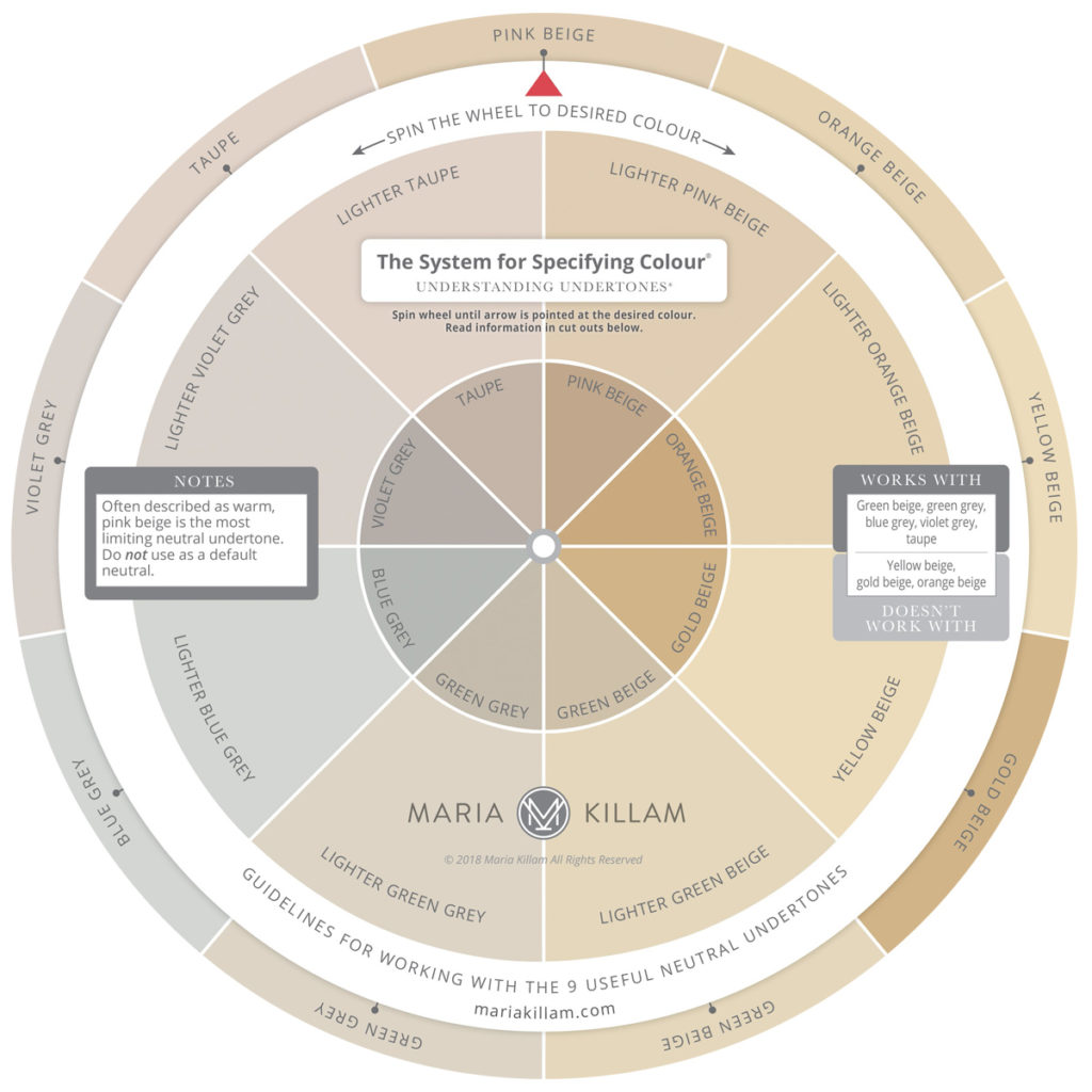
Maria’s system divides neutrals into nine main undertones. Learning to tell neutrals apart and being able to find them easily on a fandeck is the key to using them with confidence. Here’s her incredible colour wheel which will change your paint choosing life!
And here’s the nine main neutrals in Resene colours:
The beiges
Numbers 1-5 of the nine neutral undertones are beiges.
Pink beige, orange beige, yellow beige, gold beige and green beige. The differences are subtle but your eyes get used to seeing them, and once you see them you can’t unsee them!
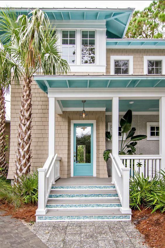
Pink Beige
The shingles below are pink beige.
Orange beige
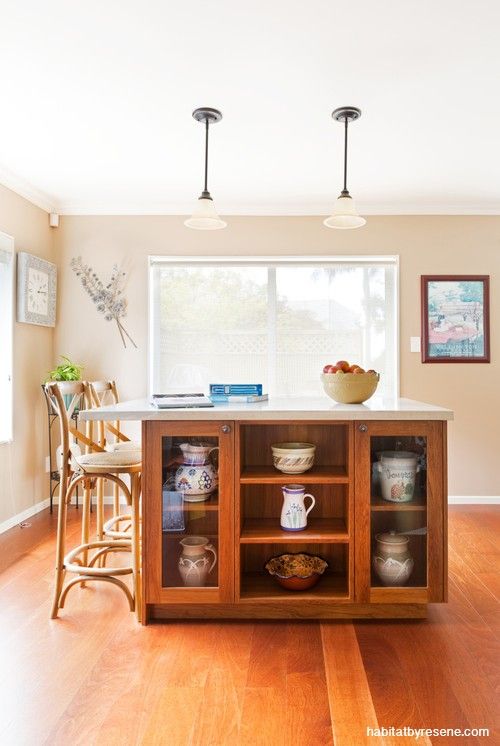
Orange beige is making a comeback. Here it is on the kitchen walls:
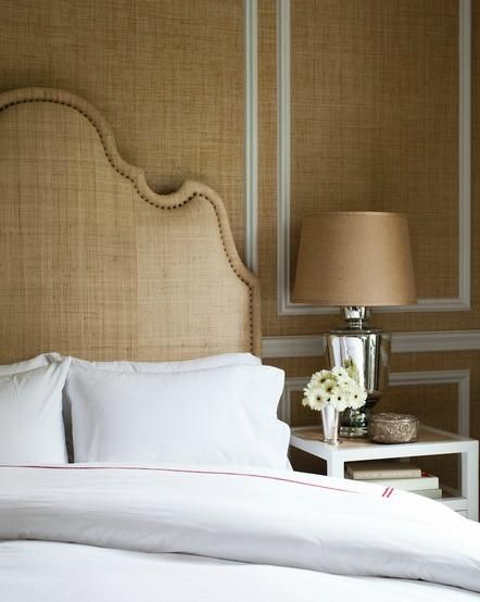
Gold beige
Gold beige on the walls and headboard. It’s a good lesson in repeating neutrals. This wouldn’t look as good if there were three different neutrals going on:
Yellow Beige
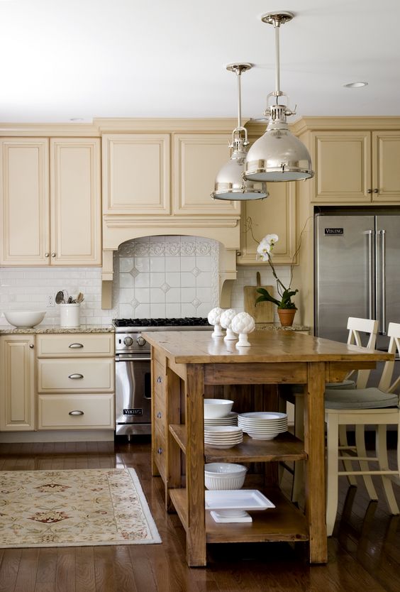
Yellow beige is what happens when gold beige goes lighter. Here it is in kitchen cabinetry.
Green beige
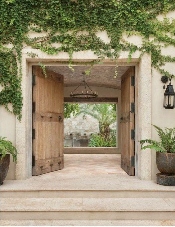
Here’s green beige looking great on an exterior. Look how well it goes with the stone.
The greys
Numbers 6-8 of the nine neutral undertones are greys.
Green grey, blue grey and purple grey (aka violet grey). I find the greys easier to figure out than the beiges. There’s less of them for a start, and blue grey is so distinctive that once you compare to that you can easily tell if the grey is greener or more purple.
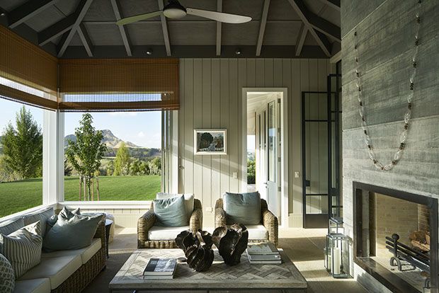
Green grey
Are the walls a neutral? Yes – but not beige or taupe. Blue grey? No. Purple grey? No. They’re green grey.
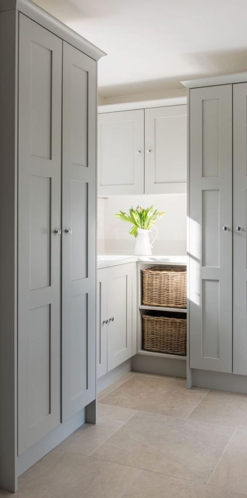
Blue grey
When you think of grey, you’re probably thinking blue grey. There’s a lot of it round at the moment and it looks great with fresh white, like here:
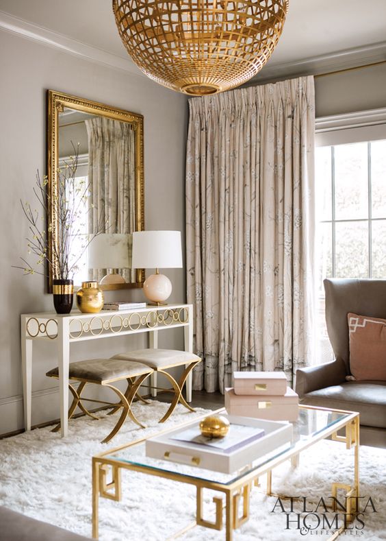
Violet/Purple grey
Violet grey won’t necessarily look purple, just a warmer grey. But if you have an aversion to purple of any sort you might like to think again. Here it is looking warm and glam paired with gold:
Taupe
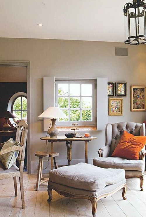
Number 9 of the nine neutral undertones is Taupe. It holds the perfect middle ground between violet grey and pink beige. It’s warmer than grey but it’s greyer than beige. Kind of grey brown. Here it is on the walls and chair:
And one more time…
View the different neutrals again next to each other and notice them change from photo to photo:
Getting practical
So once you can recognise the different neutrals, how do you use that to create beautiful layered rooms?
Rule #1 – stick to one or two neutrals and repeat them.
If you are working with existing finishes, work out the neutral undertones you already have and limit yourself to either that same undertone or one other undertone that goes with it.
If you’re starting from scratch you have a few options:
- choose a ‘white’ foundation palette and pick a neutral which works well with it
- choose a starting point – a cushion, fabric, sofa, piece of art or photo and build a palette from there. Ask yourself – which white works with this? Does it already have a neutral? If it doesn’t, which neutral works best with it?
The Saltwood House
Our lovely Saltwood House clients were doing a renovation refresh – new kitchen, new hard flooring and carpet and one new paint colour to pull everything together. They already had a lot of furniture and loved a minimal high contrast look, mostly monochrome with lots of black and white and luxe metallic accents. Here’s some of the inspiration images, capturing their vibe:
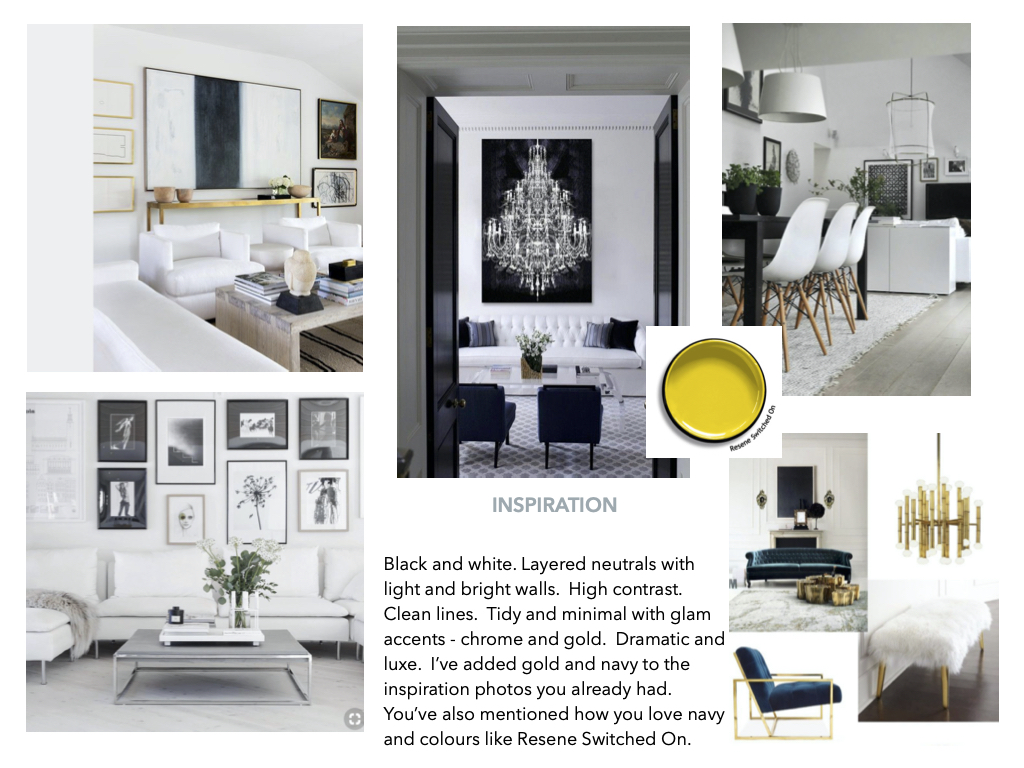
The only hard finishes we had to work with were dark window joinery (luckily perfect with the black and white palette) and green grey bathroom tiles.
True white was the best white for a clean black and white palette, but we also wanted to add a barely there neutral for some subtle contrast. We instantly ruled out the beiges, which left us with greys and taupe.
Green grey wasn’t fresh enough. In fact the existing colour was a green grey, which looked a little dirty and didn’t capture our client’s vibe. Violet grey could’ve worked, but there was no other violet grey anywhere and we had no plans to introduce it. There was plenty of silver though – silver in the furniture, silver mirrors. So we ended up with Resene Sea Fog, the palest of blue greys, and a dark high contrast carpet.
The Sea Fog looks AMAZING. It’s just gorgeous with the new white kitchen and timber flooring. It’s fab with all the blacks and metals. I almost want to go all arty and tell you it’s a nebulous greyish mist, floating gently like a whisper of silk, but I-will-resist. It works, not because it’s a nice colour, but because it’s the right colour for the space.
Now, about those green grey bathroom tiles…the Sea Fog is fine with them. Not ‘perfect’, but blue grey and green grey are ok together, and in situations like these a spot of decorating makes all the difference to making your eye look where you want it to.
The right neutral matters
So now you know the nine neutral undertones, the difference the right neutral can make and how to sort one from the other. You’ll be able to avoid the stress (or thrill, depending on who you are) of painting 10 random colour samples on your walls and asking everyone what they think. You’ll be able to narrow your options down to only good choices straight away.
Next time I’ll be sharing my NZ neutrals wheel with you and talking about how to use Resene colour cards to make choosing neutrals easier.



Thanks for your blogs, they are really helpful!
I am doing up my late 90’s house. It currently has very nineties blue carpet and light blue aluminium windows and cream walls (revolting I know :-)). Now I know I can replace the flooring easily and I can paint the walls, but I am stuck with the aluminium windows.
I am thinking light wood flooring, what wall colour would work best with the blue windows to make them look more modern and intentional?
The house is a standard New Zealand house on poles with white cladding and a grey colour steel roof. We are coastal and the living areas have huge windows overlooking the sea and hills.
Hello! We’re painting the outside of our new house Resene Half Ash – would love to know what sort of undertone it has. I’m thinking green… and the Resene website says the colour palette is Green – is that a good guide?
Next question – do I need to continue the green undertones to inside? I’m quite liking the idea of Resene Triple Tea for my kitchen cabinets. Haven’t chosen wall colour yet but aluminium joinery is matt titania. Love to hear your thoughts!